Our customers say


Ebbets Field Flannels: Embracing a Timeless Perspective on Authentic Vintage Sports Apparel

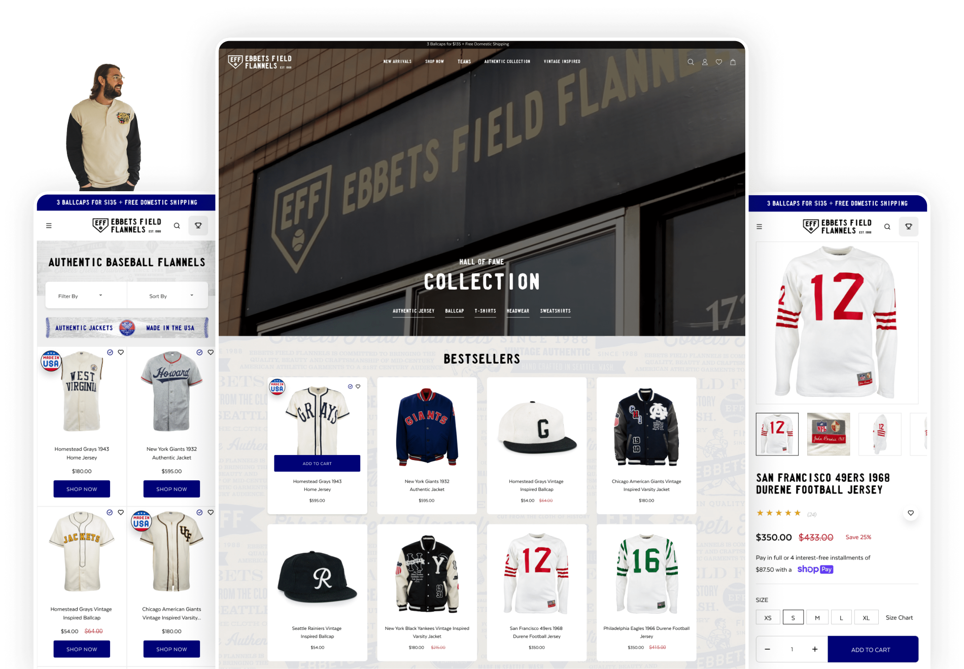
Ebbets started its journey with vintage apparel and replicas and has grown significantly over the past three decades. Today, their clothing is available both online and in physical Lids stores. Collaborating closely with the teams from Lids and Ebbets, we dove into understanding the brand's identity. Our goal was to adopt a mobile-first UX approach, in order to seamlessly integrate Ebbets into the current digital landscape while preserving its distinctive vintage aesthetic.
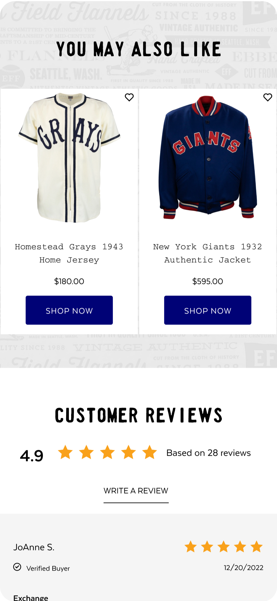
With a dedicated and loyal customer base cultivated over 30 years, maintaining familiarity and ease for users with the new site layout was a primary focus. Our approach focused on the philosophy that, "shopping online should be easy." To achieve this, we strategically implemented AI-driven product recommendations, using Rebuy's AI upsells in carousels. This increased the overall user experience, and also ensured a fresh and easily manageable product offering, aligning with Ebbets' commitment to a timeless style with a modern approach for convenience.


24%
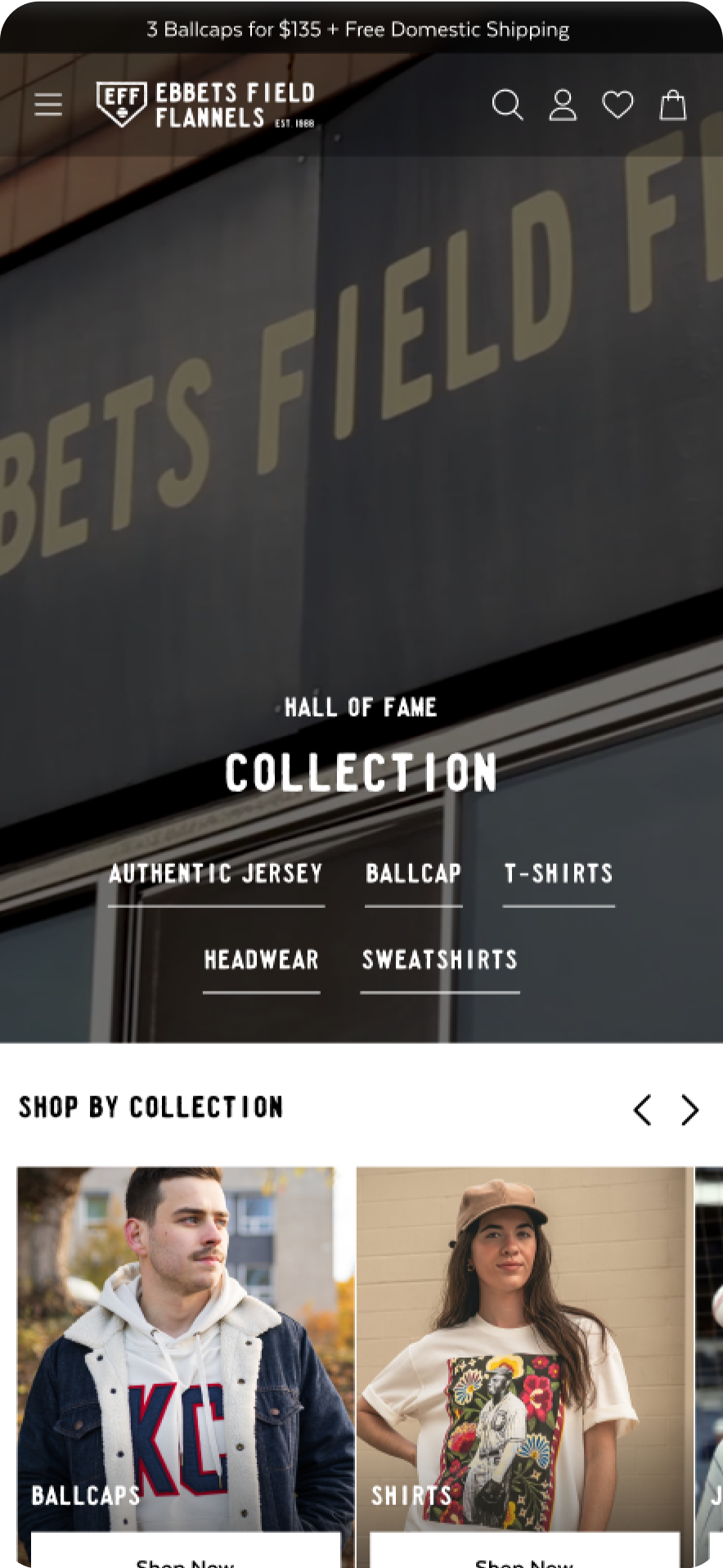
Up to 24% higher conversion with one-click shoppable collection & home pages.
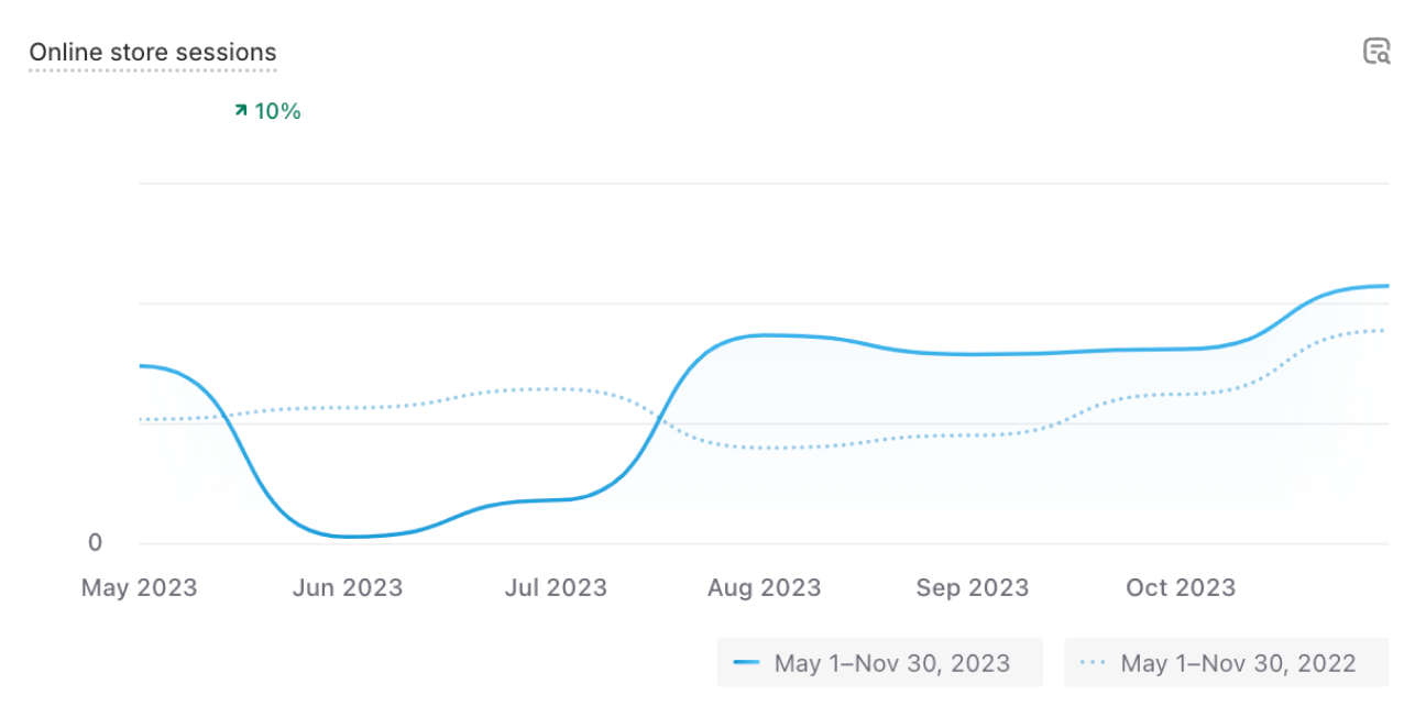
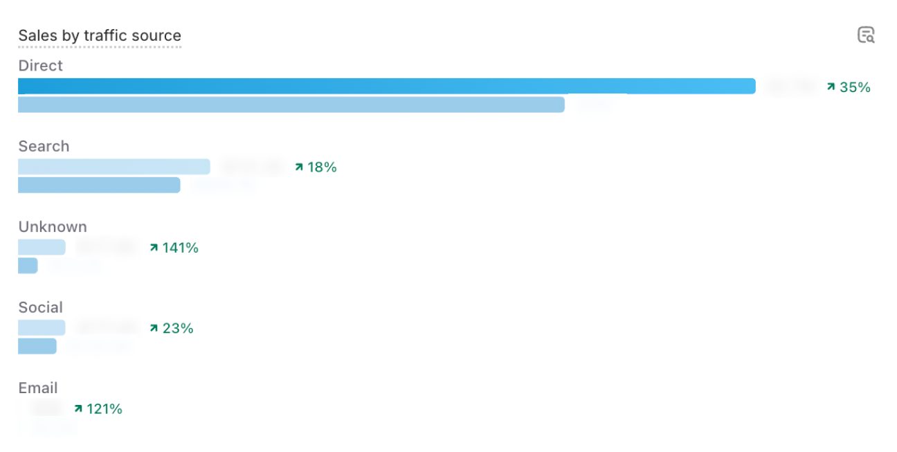
35%
Traffic Increased by 35% in 6 months through the use of strategic, SEO friendly product placement and content.
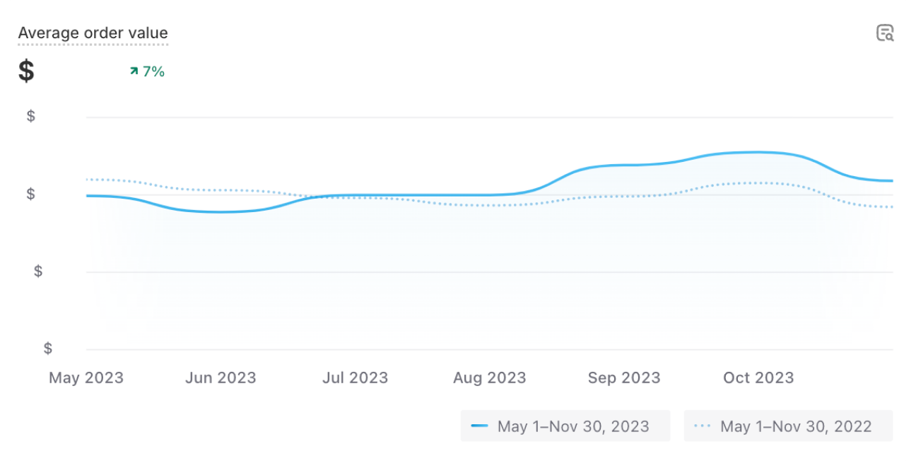
7%
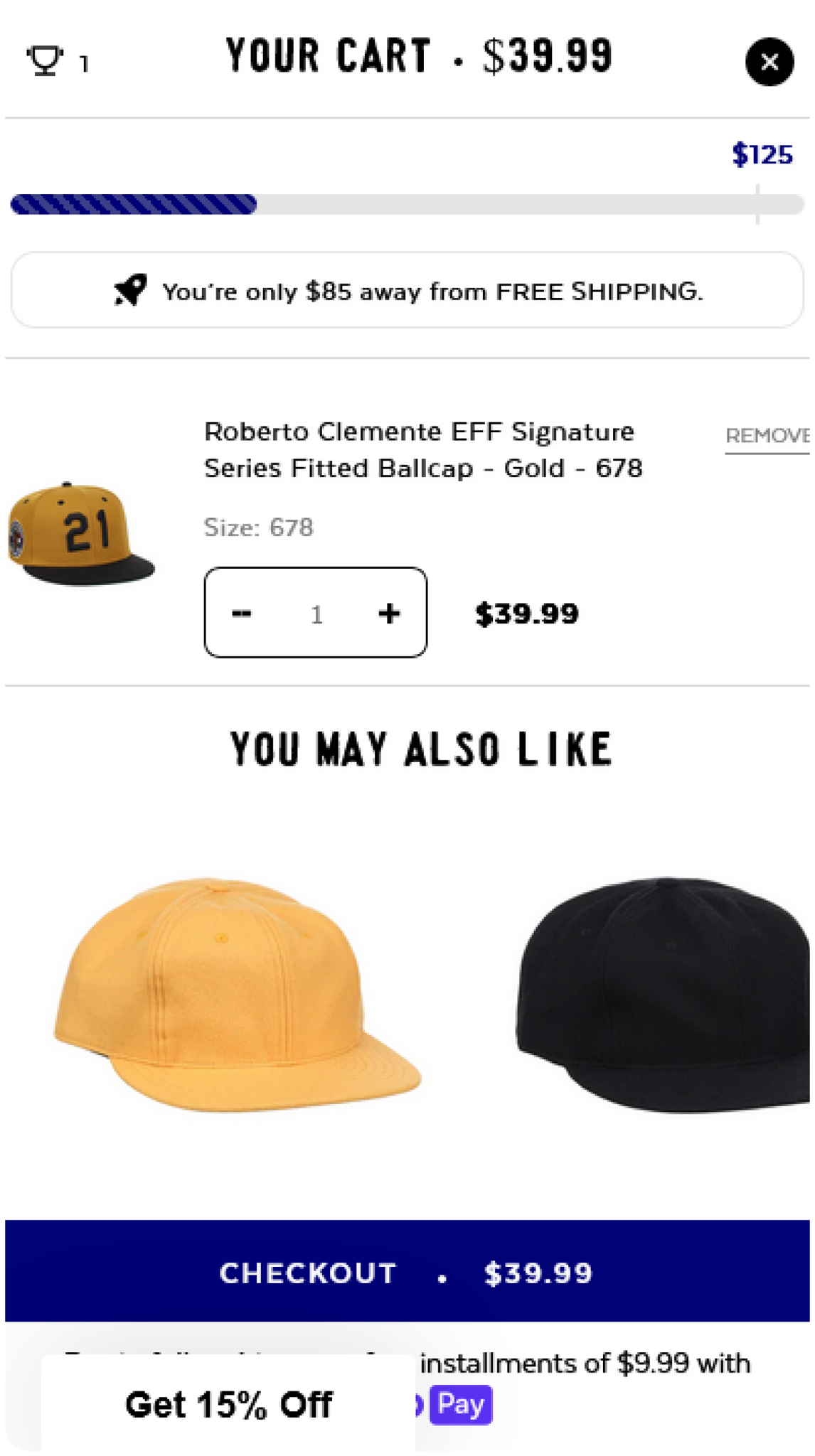
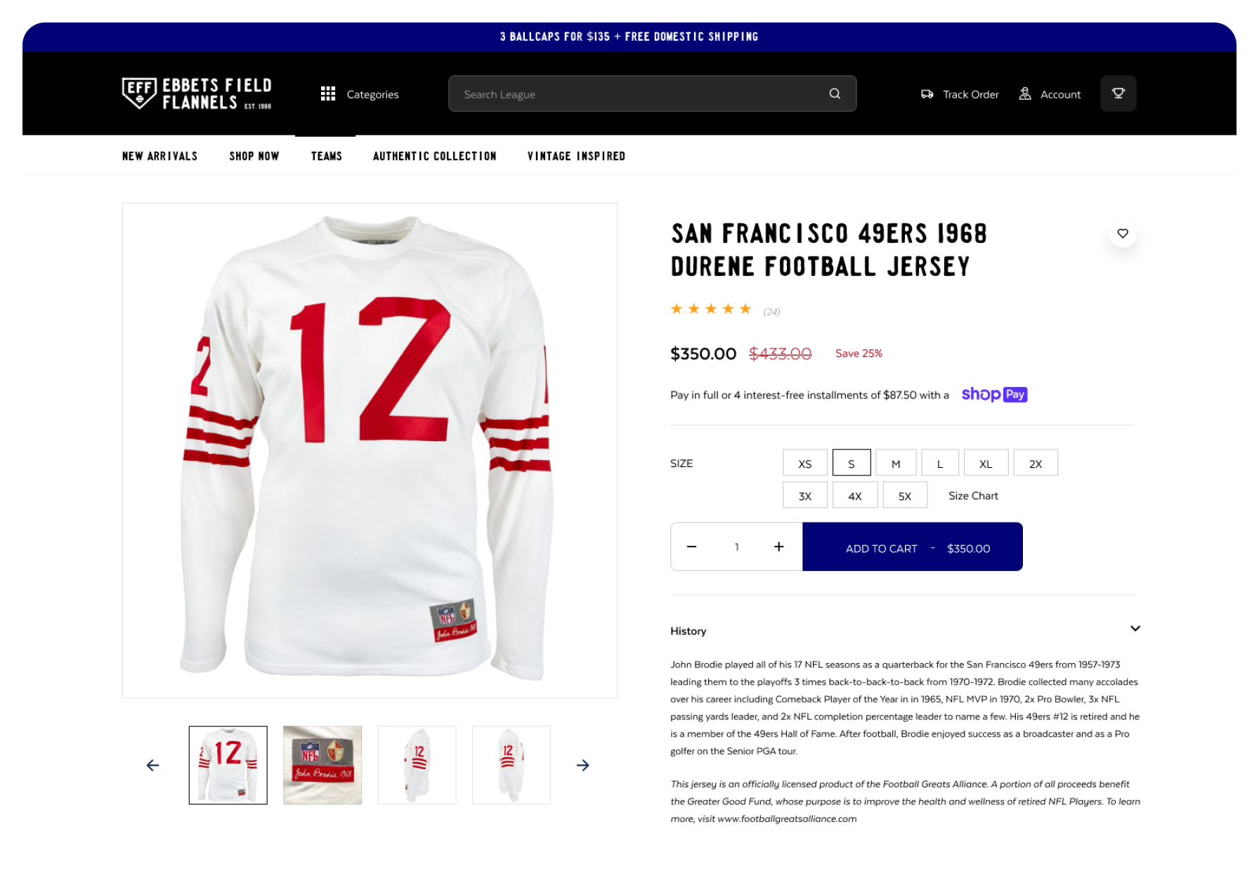
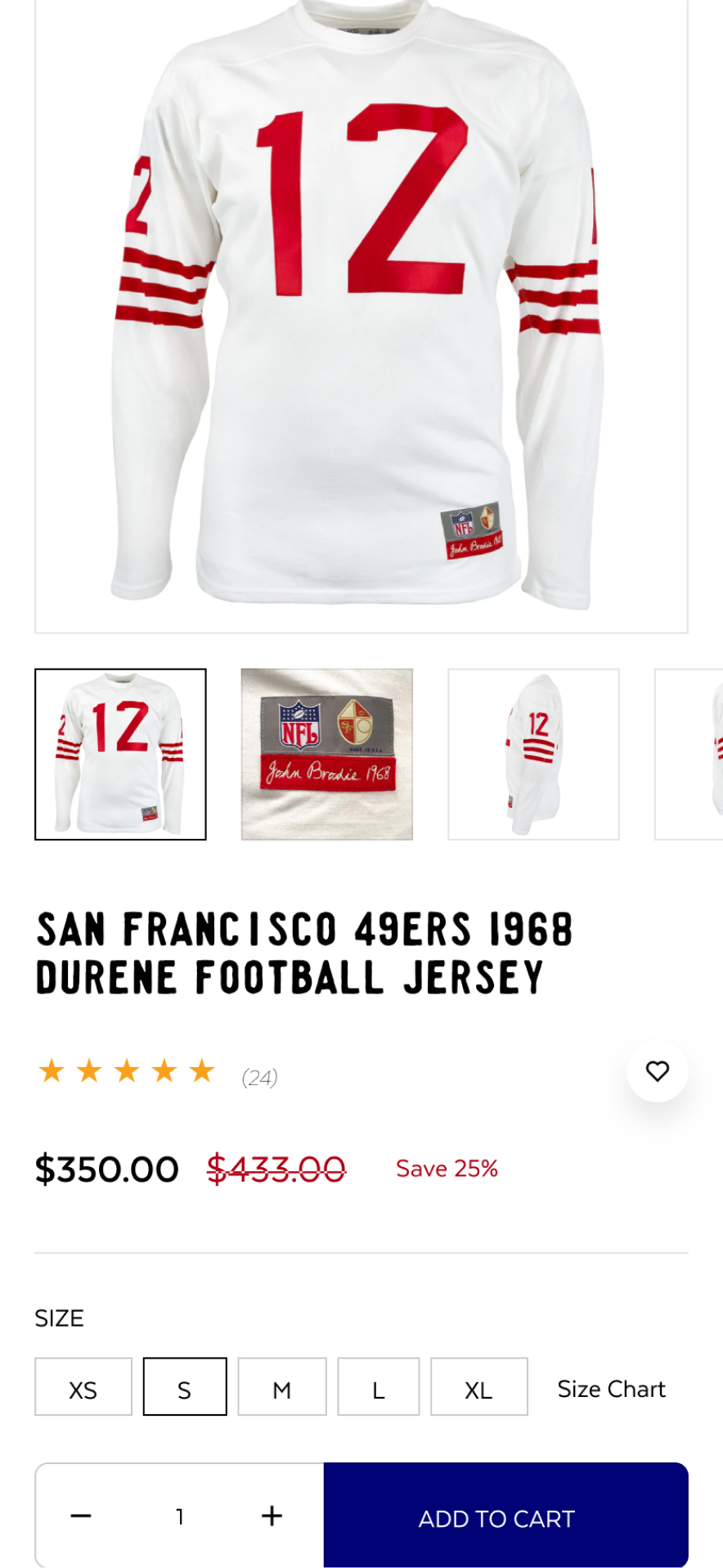
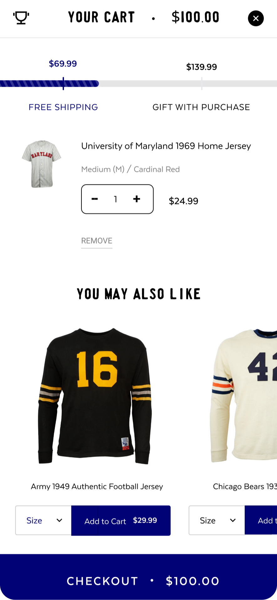
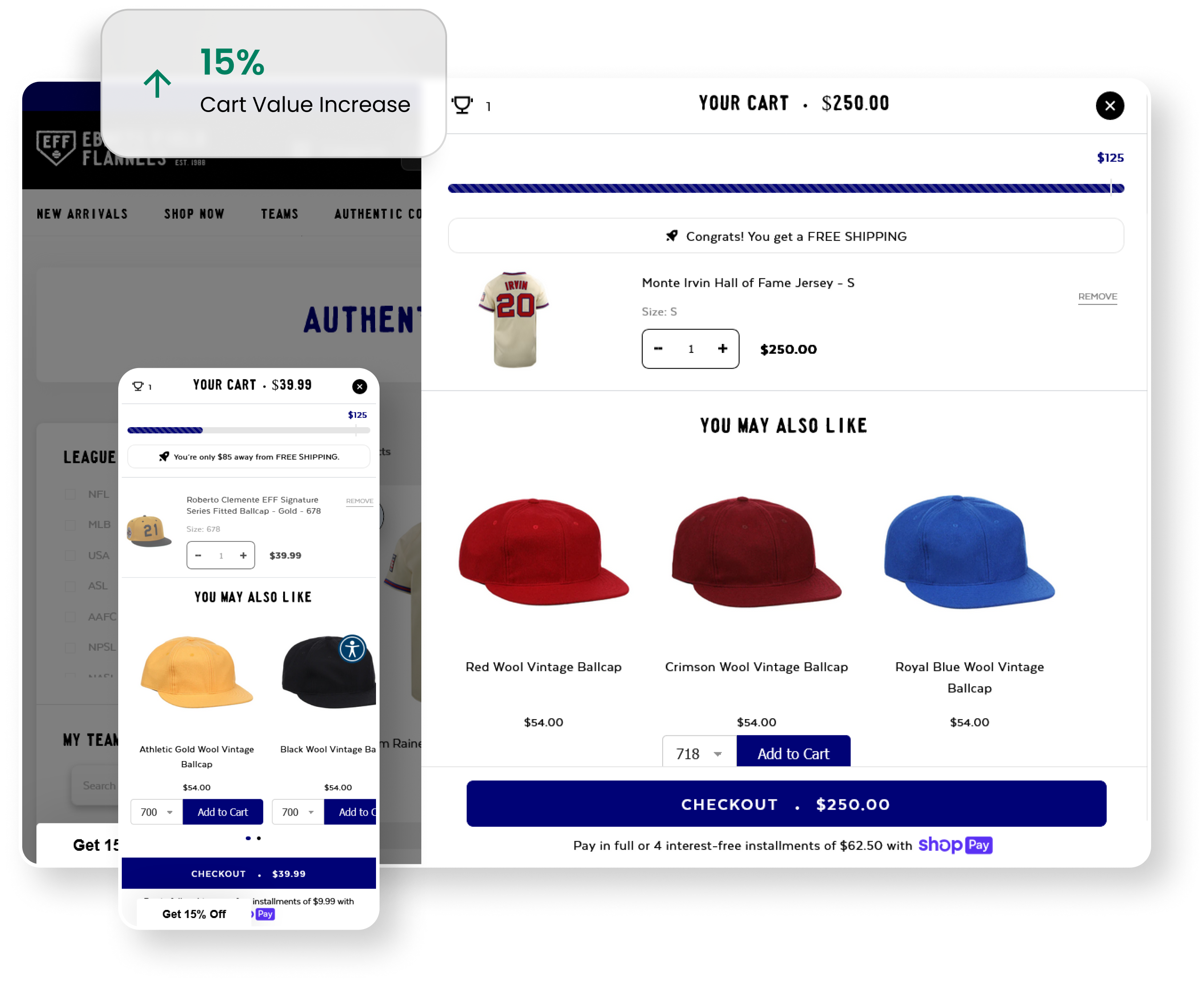
With an Optimized Product Page and Cart Drawer, we increased Average Order Value by 7%.



The Challenge
The quick move towards mobile-first trends in e-commerce posed both an opportunity and a challenge for Ebbets. How could they seamlessly carry over the success of their brand identity to an online platform without compromising its essence? This transition meant a move from a basic Shopify theme to a finely tuned, UX optimized, AI-powered, and completely custom 2.0 theme.
The Solution
Our collaboration with Ebbets began by understanding their specific requirements and objectives. Within a short four-month time frame, we rolled out their new site to achieve the following milestones:
- Initial Setup: Beginning with a tailored UX design, we customized a user-friendly, intuitive online store by building on a new 2.0 theme on Shopify. This approach granted Ebbets the flexibility to improve both the user experience and customization options within their theme.
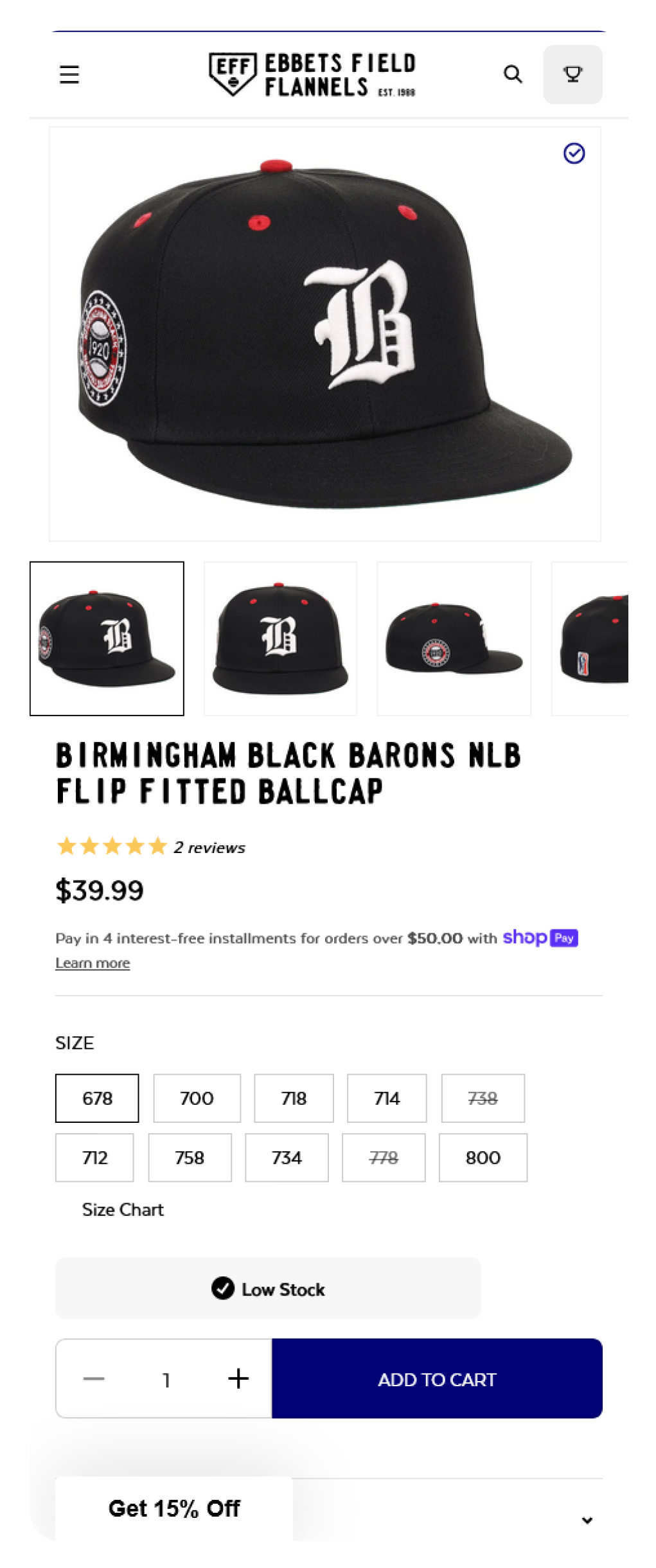
- Optimized for Mobile: Prioritizing a mobile-first approach, we made sure that every aspect of the site was optimized for mobile shopping, increasing engagement and overall conversion rates.
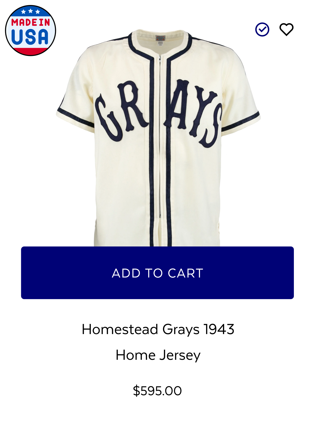
- Easy to Shop: Implementing strategically placed AI product carousels powered by Rebuy AI Engine, we were able to provide "smart" product suggestions for users. This included one-click shopping options on the homepage, product pages, collection pages, and cart drawer, streamlining the entire shopping experience.
- Transparency: Since their product line consists of both ready-to-ship and made-to-order items, we introduced real-time inventory updates on a product-by-product basis. This not only created a sense of urgency but also increased brand trust and transparency, by providing accurate manufacturing and shipping times throughout the user's journey.





A truly diverse range of action
Arctic Grey collaborated with Ebbets to improve the user experience across both mobile and desktop platforms, by implementing quick add to cart features, and maximizing upsell and cross-selling potential. Another important improvement was the creation of a seamless checkout process designed to minimize issues and enhance conversions. Based on our expertise, we pinpointed strategic upsell opportunities within the checkout funnel, leading to a significant enhancement in Conversion Rate (CR) and Average Order Value (AOV).
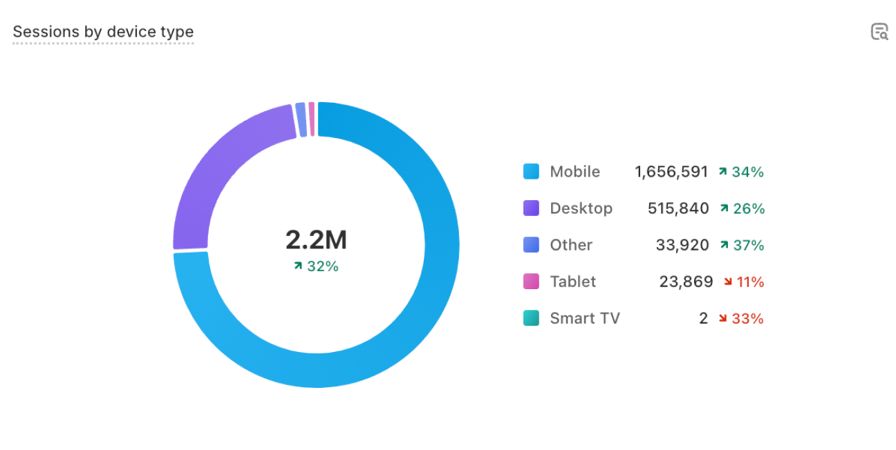
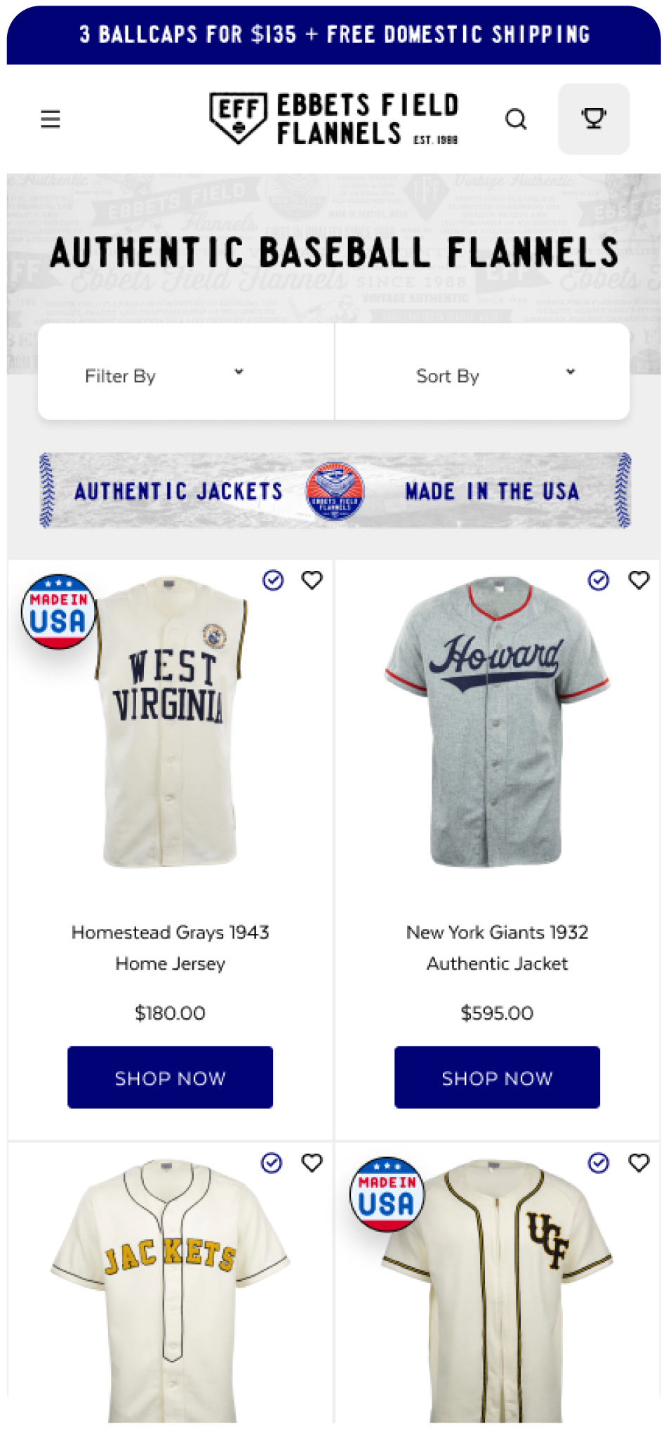
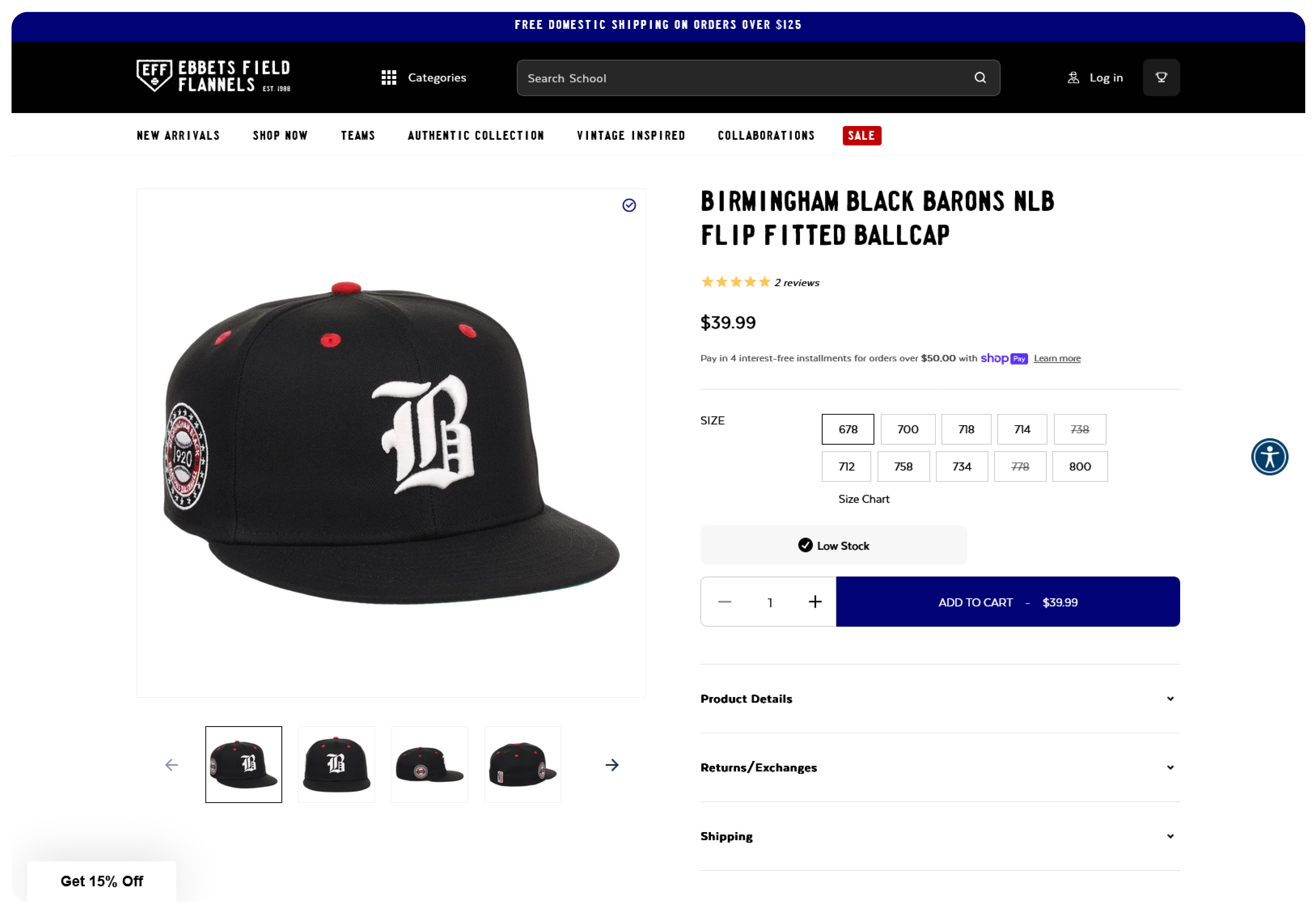
Taking a Mobile-First Approach: Prioritizing the mobile experience expands your reach, and helps with capturing more leads and increasing conversions. Due to the high number of people using their mobile devices for search and online shopping, an optimized mobile UX is extremely important. Search engines favor mobile-friendly websites, resulting in higher rankings and increased search traffic. Mobile users have different browsing habits and intentions than desktop users. Addressing the specific needs of mobile users aligns the UX with their behavior and increases overall conversions. For Ebbets, this involved fine-tuning content and button placement to make mobile shopping easy, and still maintain alignment with their loyal customer base and brand identity.
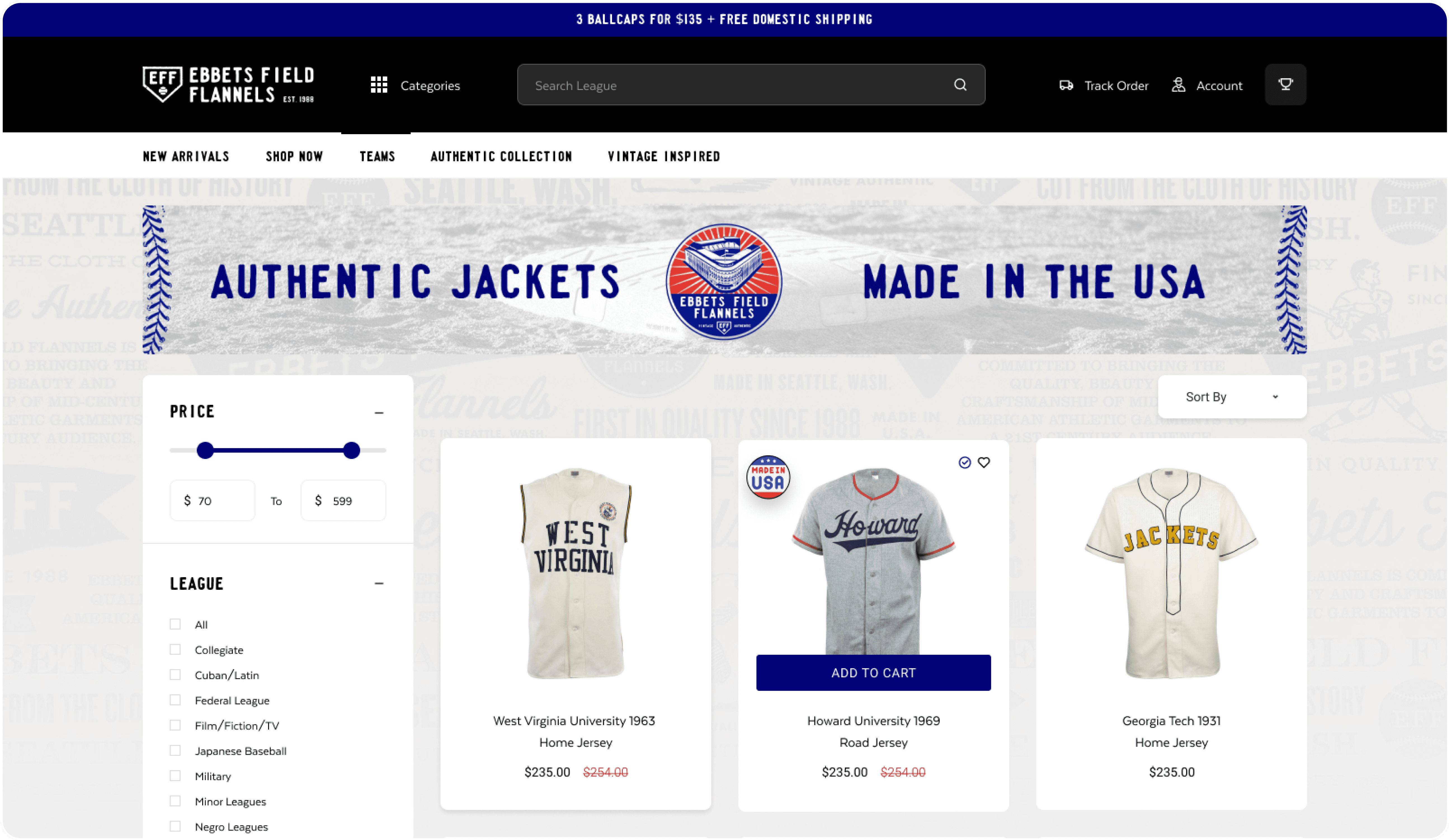
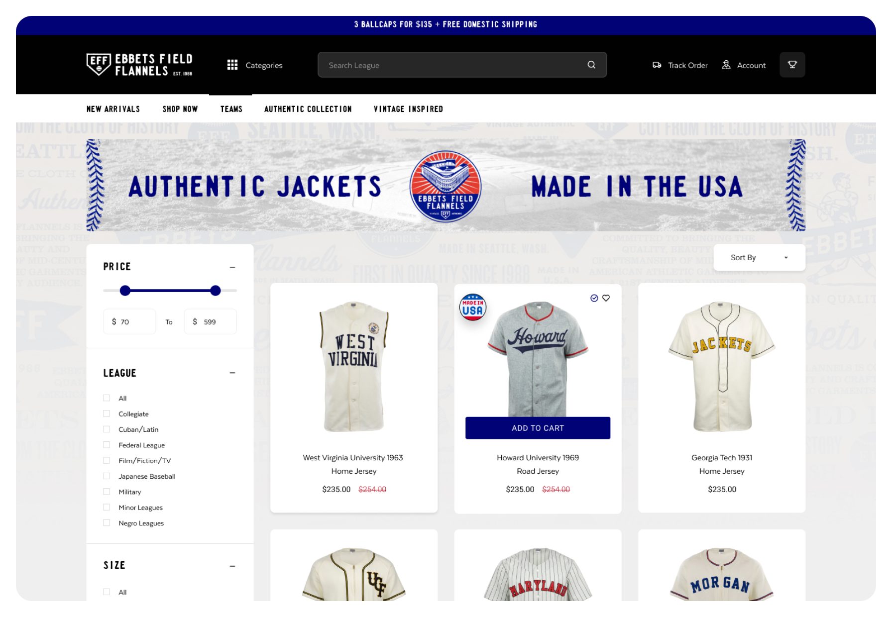
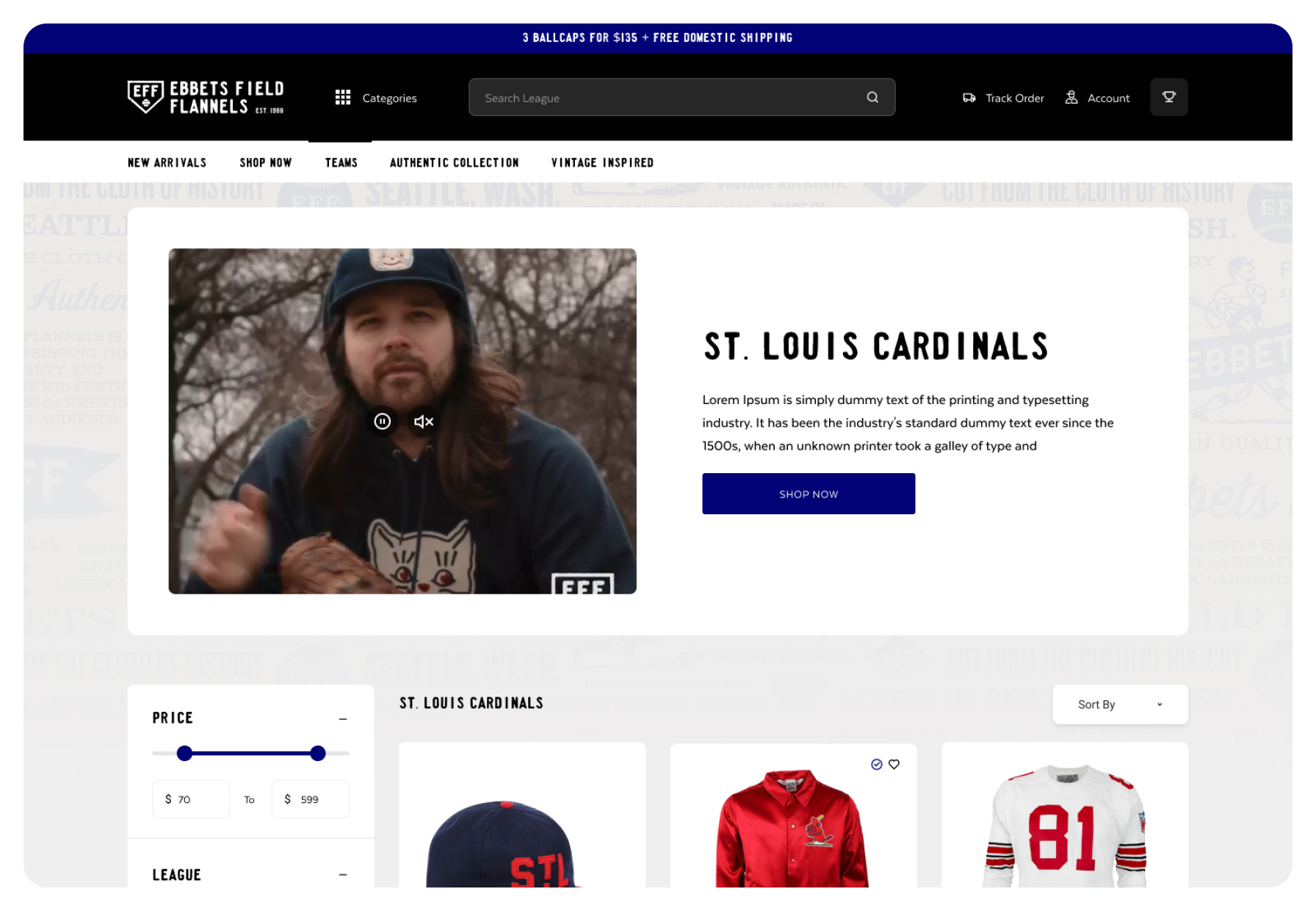
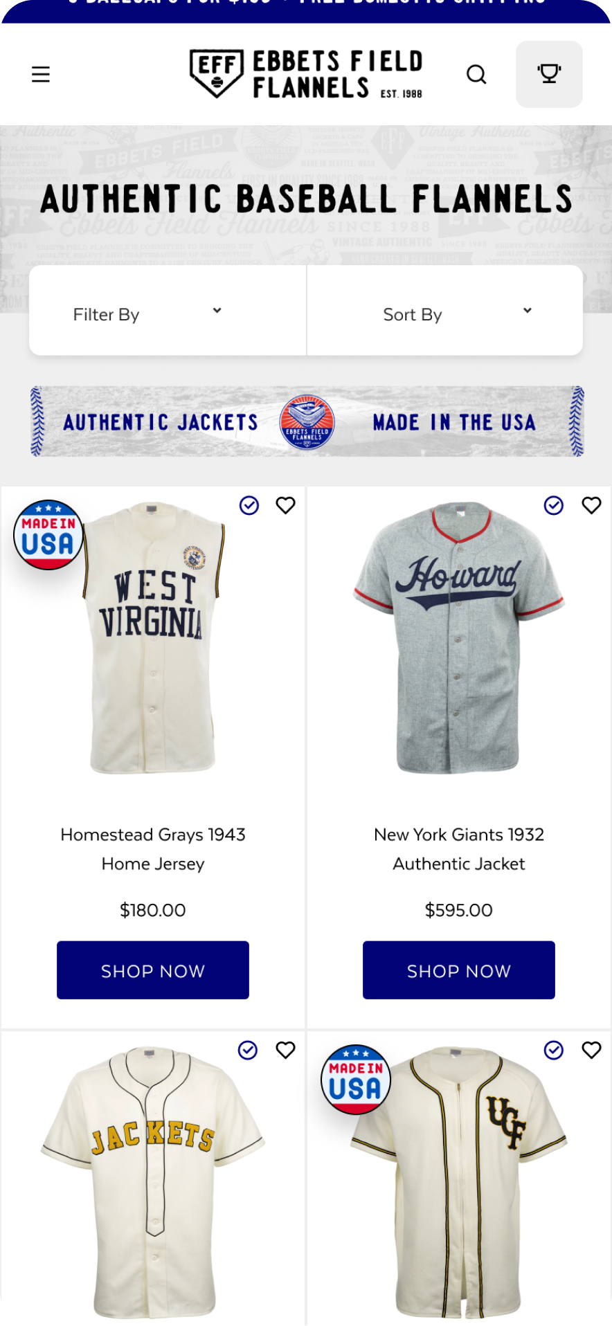
In the current digital environment, where users are presented with multiple choices, an exceptional UX becomes an important distinguishing factor, enabling a business to differentiate from its competitors. A user-friendly UX design simplifies the conversion journey, minimizing obstacles and facilitating users in completing desired actions, be it making a purchase or signing up for a service. With Ebbets, our objective was to implement advanced filtering options on collection pages and enhance the overall spacing and button placement to optimize the user experience.
When products are strategically positioned and align with users' search queries, it improves the website's ranking in search engine results. This also increased organic traffic to the site. Google prioritizes user experience as a crucial ranking factor and positions those with optimized UX higher in rankings. By leveraging upsells, optimizing their UX and content, and precise product placement, we achieved 29% increase in online store sessions in 60 days post launch.
The speed at which your website loads significantly impacts your conversion rate. If it's too slow, customers are more likely to bounce, leading to missed opportunities. In fact, a simple one-second improvement in load speeds can yield a 17% increase in conversions. Our goal was to ensure exceptional, high-speed performance across both desktop and mobile platforms. Our dedicated efforts resulted in impressive site speed results even with the use of multiple 3rd party apps integrated on site.
Arctic Grey UI/UX Design Approach.
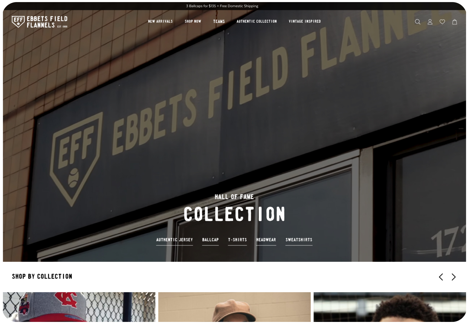
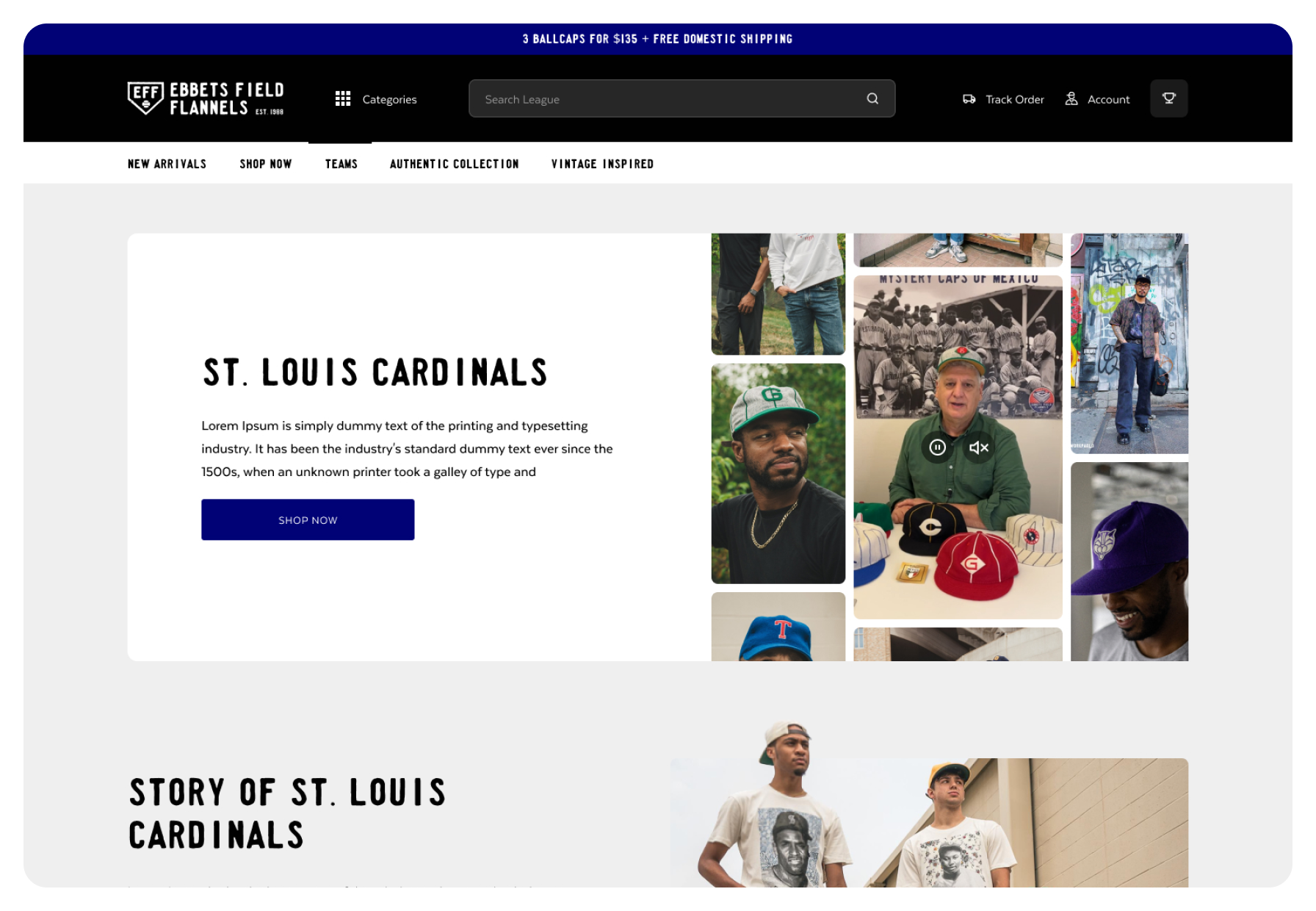
Enhancing desktop user experience is important for retaining visitor engagement and satisfaction on any website. Our emphasis for Ebbets was on intuitive navigation and filtering, responsive design, and compelling calls to action.
When designing the new Ebbets.com, we focused on a easy to shop and navigate site, while preserving a consistent brand identity, keeping their colors, fonts, and design elements across the entire website.
The well-spaced content was selected for ease of information consumption, facilitating focused attention on essential elements. This approach resulted in smoother browsing, higher click rates, and improved conversion rates.
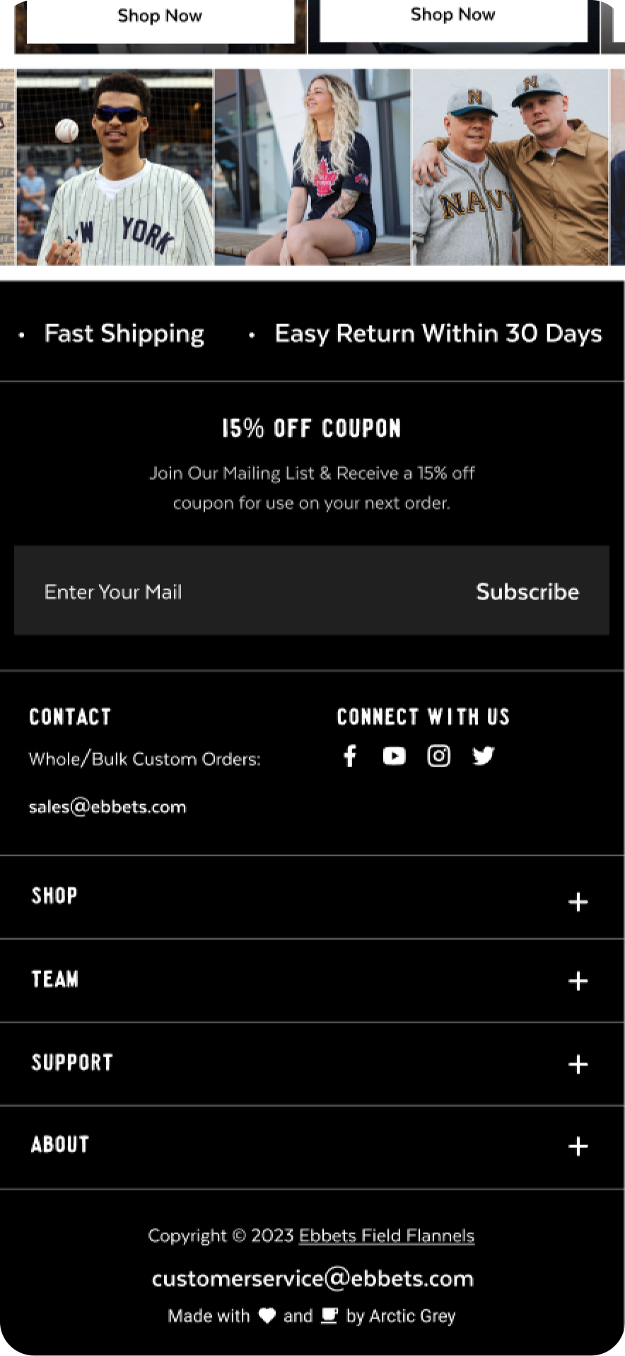
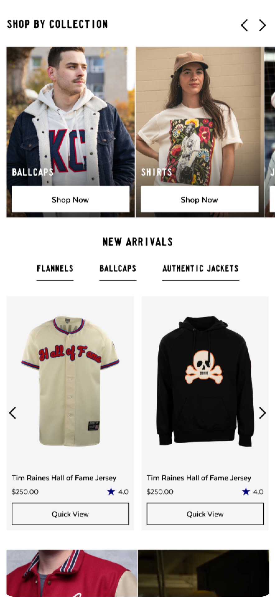
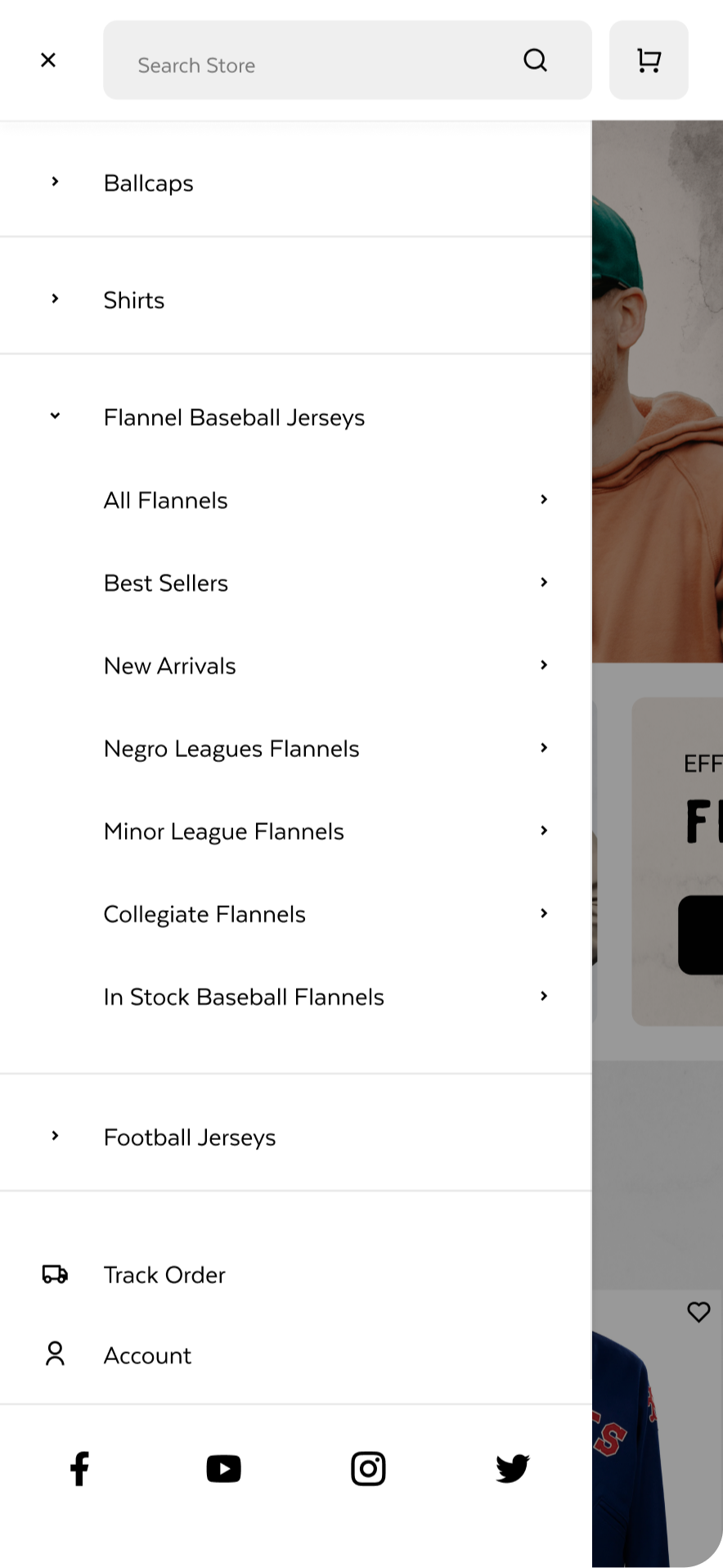
Mobile UX: Our focus for Ebbets centered around a mobile-first philosophy, prioritizing intuitive navigation and filtering, responsive design, and compelling calls to action tailored for smaller screens. We meticulously maintained a consistent brand identity, ensuring colors, fonts, and design elements flowed seamlessly throughout their mobile interface.
The well-optimized spacing of content aimed at enhancing information consumption, allowing users to focus on essential elements while using the minimal space available on mobile devices. This approach contributed to a smoother mobile browsing experience, increased click-through rates, and enhanced conversion rates.












The Results
Arctic Grey partnered with Ebbets to enhance user experience on both mobile and desktop platforms, focusing on streamlined checkout, increasing upselling, and ultimately achieving large improvements in Conversion Rate and Average Order Value.
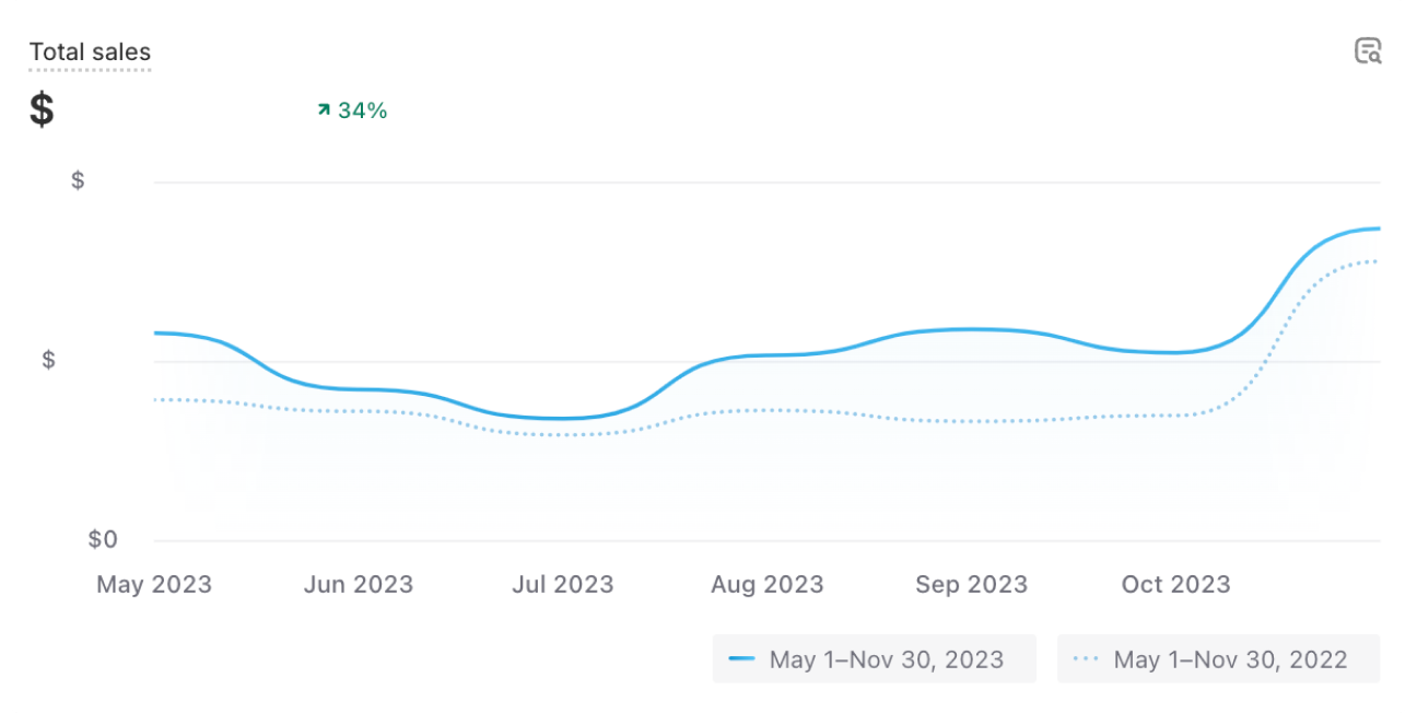
Online sales increased significantly, contributing a substantial portion of the overall revenue.
Prioritizing a Mobile-First Approach enhanced reach, captured more leads and conversions, and optimized search engine rankings, as exemplified by our tailored strategy for Ebbets.
Enhanced sales and overall conversion for Ebbets were achieved through intelligent product recommendations and improved collection and product pages, resulting in a more user-friendly shopping experience.


Accelerate your Growth with powerful Shopify Features
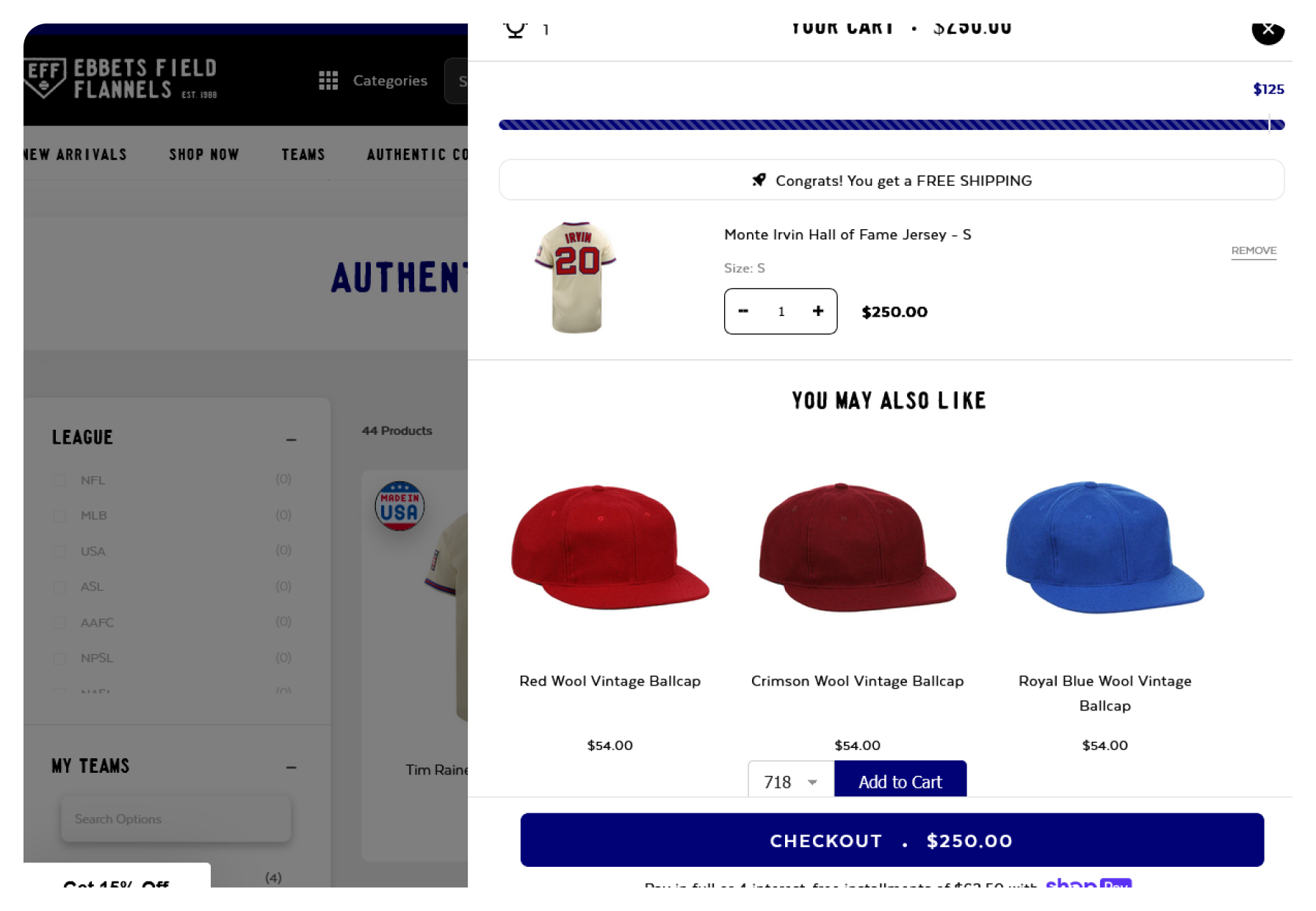
UX for Cart Drawers
Easily view cart contents and upsells through a sliding cart drawer modal, allowing users to stay on their current page and continue shopping without navigating away to a separate cart page.
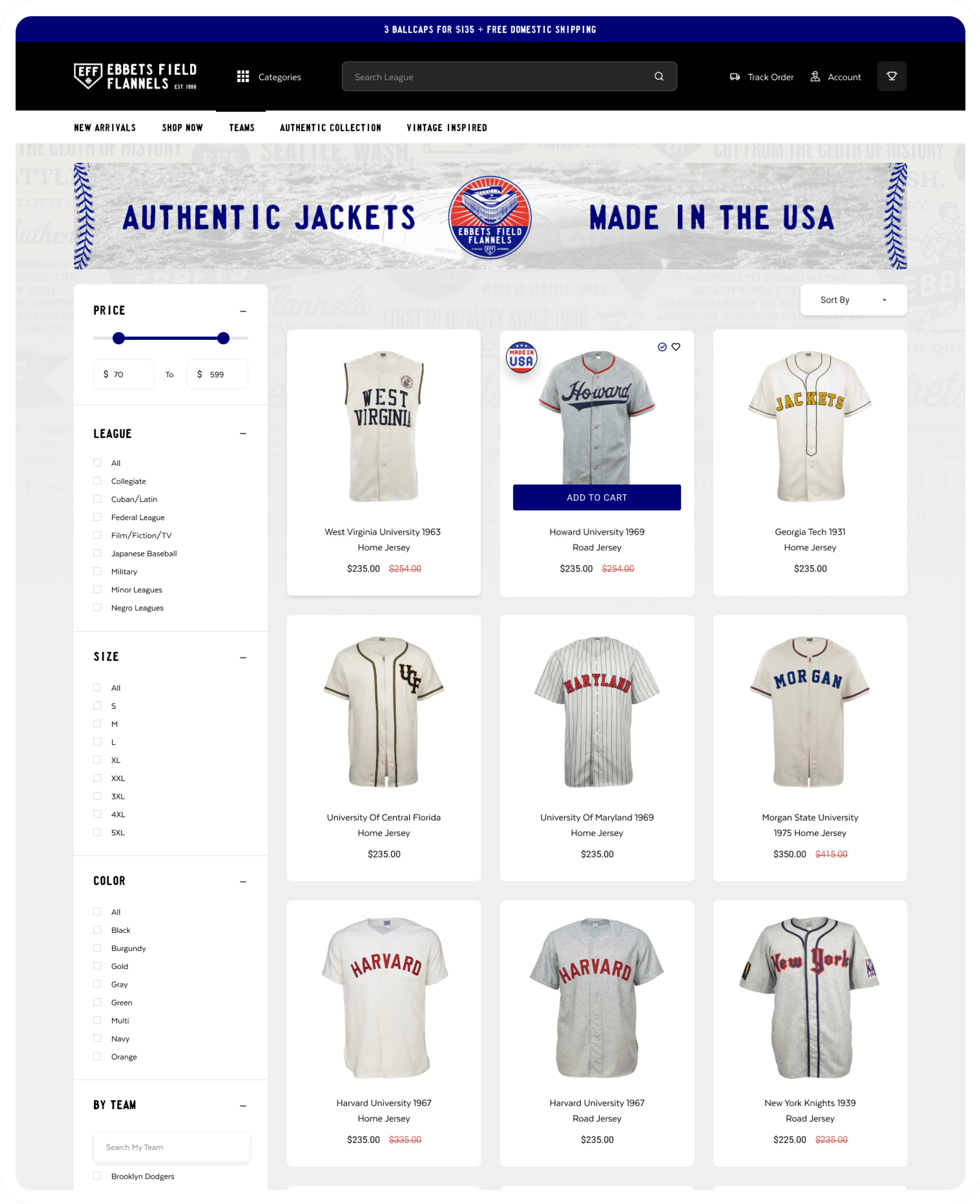
Shoppable Collection Pages
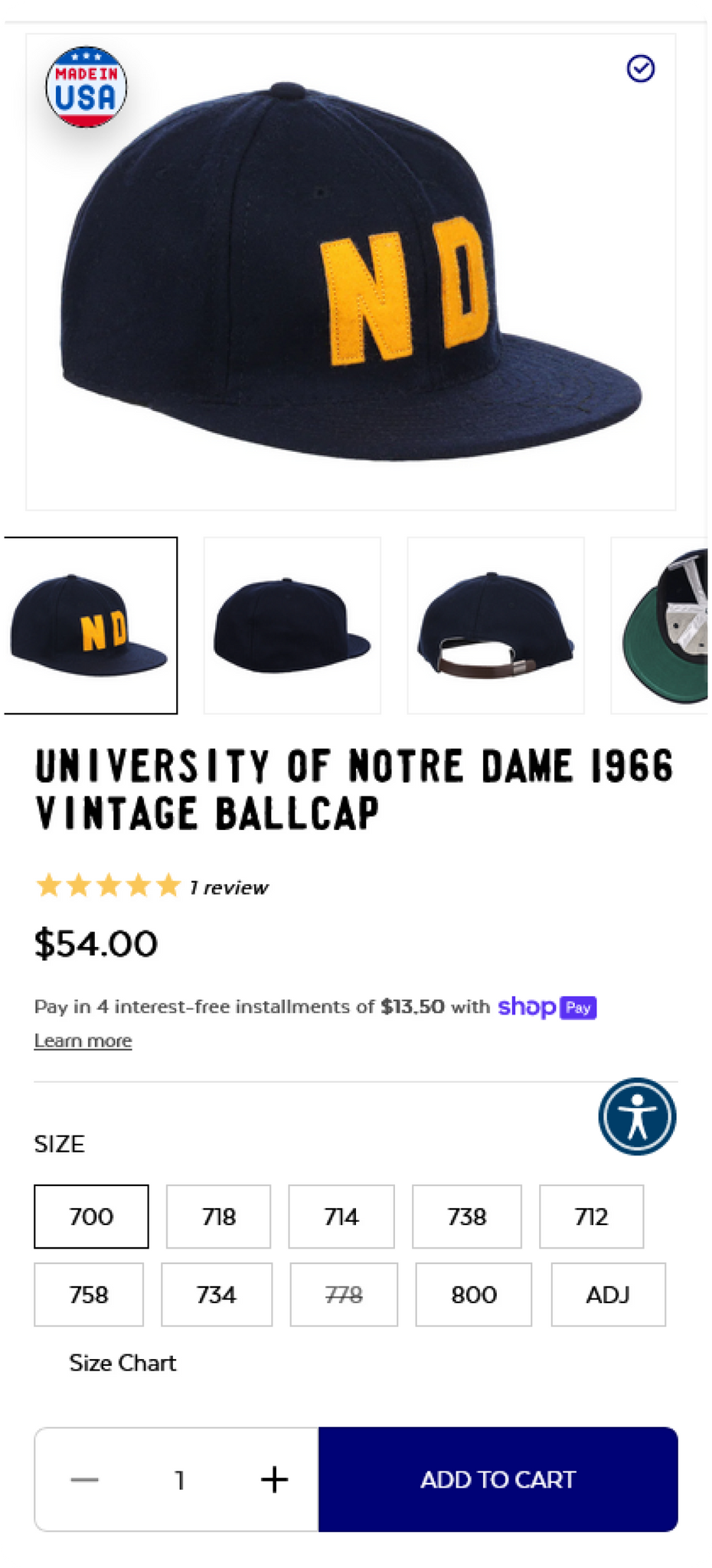
Reduce drop-offs by enabling shoppers to swiftly and seamlessly add items to their cart with a quick-shop feature, providing direct visibility of all in-stock sizes and colors on the collection page.
SiteSpeed
Improving site speed not only reduces bounce rates but also enhances search engine rankings and overall conversion rates significantly.
Improved shopping experience with Search & Filters
Implementing Advanced Search and Filtering options on Ebbets's collection pages, enabed customers to effortlessly navigate the product selection and quickly add items to their shopping carts. The quick-shop feature improves the shopability of the collection pages, allowing users to easily add multiple items to their carts without losing progress on the same page. This seamless functionality keeps users engaged with more efficient browsing and purchasing, resulting in increased average order value and conversions.


Our Process
Discover
Define
Develop
Quality Assurance
Deliver
A/B Testing

01 Research

We start our partnership with a client with a kick-off call with a dedicated member of our Success Management team. There, we discuss the site in detail, UX and UI goals, any existing pain-points, and potential solutions. Our team of Success Managers have extensive knowledge of Shopify, and provide ongoing support and daily communication to our clients.
02 Branding

We believe in the power of simplicity and strive to create eCommerce solutions that embody both elegance and functionality.
03 UX Design

From there, we dive right in to the branding and UX design with our talented team of designers. Our focus on delivering results has solidified our commitment to crafting the finest Shopify experiences through dynamic and beautiful UX and UI, and The Cashmere Sale was no exception.
04 UI Design

Our global team of developers are unparalleled in the pursuit of perfection of creating dynamic and responsive themes, that also allows a merchant the ability to manage their site through advanced customization features.
05 Development

We are multi-award winning Shopify Plus Design & Development Firm.
At Arctic Grey, we craft the most exceptional eCommerce solutions for Enterprise Merchants worldwide. Our commitment to excellence is evident in the overwhelmingly positive feedback from our clients, with over 500 Five Star Reviews.
06 Quality Assurance

Our talented Quality Assurance team test each element of a new site, from both a technical and user’s perspective. They are true perfectionists, and have extensive knowledge of UX and UI best practices on all mobile and desktop devices.
07 A/B Testing

AB Testing is crucial, and we are passionate about delivering excellence for our clients by using clear, data-driven results driving all decision making.
The Multi Award Winning Shopify Management Team at Arctic Grey


Engineering each solution
Arctic Grey has taken an innovative approach to customer experience. We conducted research that pinpointed areas of confusion around our product offering, allowing us to make adjustments and improvements for the user journey - so customers shopping can have a more engaging experience. Our findings will serve as guidance in developing future projects moving forward.
During the project, we provided and continue to provide the following services and support:
- Strategic Product Placement
- Email Marketing Optimization
- Full Responsive Experience
- Site Speed Optimization
- Core Web Vitals Management
- 24/7 On Demand Support
- Custom Upsell Cart Drawer
- CRO & AOV Optimizations
- E2E Shopping Experience


Checkout extensibility includes a robust set of platform features facilitating easy customization of your checkout in Shopify. This approach is app-based, upgrade-safe, enhances conversion rates, and seamlessly integrates with Shop Pay. Utilizing checkout extensibility, you can customize your checkout through code-free options using apps and branding tools, or opt for a more tailored checkout experience with our collection of components and APIs.
For Ebbets, we optimized their checkout experience using Shopify Checkout Extensibility, incorporating additional Shopify payment options and address validation through Shopify Functions. We also implemented one page checkout, engineered to reduce cart abandonment. This quick update to the previous Shopify checkout flow results in a 36% higher conversion rate compared to competitors.
Ebbets now uses Shopify Checkout Extensibility, and wow!
By leveraging Shopify Checkout Extensibility, we improved Ebbets's checkout process, introducing one page checkout, and address validation. This implementation effectively minimizes cart abandonment, resulting in an outstanding 36% higher conversion rate than competitors, thereby amplifying sales and fostering business growth.

The Conclusion
The evolution of Ebbets.com from a basic online store to an optimized online powerhouse reflects the adaptability and innovation ingrained in their brand. Our collaboration, supported by Shopify's robust and flexible platform, propelled them to excel and scale their growing business, ensuring a promising and flourishing future for this beloved brand.


