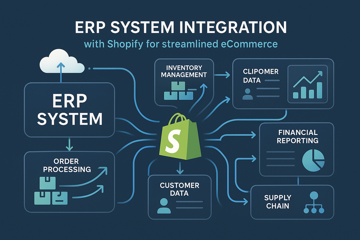
In today's eCommerce landscape, where inventory turns over rapidly and customer expectations run high, connecting your Enterprise Resource Planning (ERP) system to Shopify can be a game-changer. This integration bridges back-office operations with your online storefront, automating flows that once demanded hours of manual oversight. If you're grappling with stock discrepancies, delayed order processing, or fragmented data across platforms, a well-executed ERP-Shopify link could transform these pain points into seamless efficiencies. Drawing from years of guiding brands through such connections at Arctic Grey, this guide unpacks the process, benefits, and considerations to help you evaluate if it's the right step for your business. Whether you're scaling operations or seeking real-time insights, these details aim to illuminate a path toward more agile eCommerce.
Understanding ERP Integration with Shopify
At its core, integrating an ERP with Shopify creates a synchronized ecosystem where data like inventory levels, orders, customer details, and financials flow bidirectionally. This isn't limited to basic transfers; it involves APIs, middleware, or custom connectors to ensure secure, real-time updates. Popular ERPs such as Oracle NetSuite, Microsoft Dynamics 365, SAP S/4HANA, Acumatica, and Odoo are commonly linked, each bringing strengths like robust inventory management or modular scalability. For Shopify merchants, this means avoiding overselling, optimizing stock across warehouses, and gaining a unified view of operations—essential for D2C, B2B, or multi-channel setups. The key lies in choosing integrations that align with your ERP's capabilities, whether it's Epicor's supply chain focus or Sage Intacct's accounting prowess, to minimize disruptions and maximize value.
The Advantages of ERP-Shopify Integration
Independent studies, including those from Gartner, emphasize how these integrations drive operational gains, often yielding ROI within months. Here's a comparative look at core benefits, grounded in real metrics from integrated systems:
|
Benefit
|
Key Mechanism
|
Potential Impact
|
|---|---|---|
|
Enhanced Efficiency
|
Automates order processing and data entry
|
Reduces manual errors by 50-70%, freeing teams for strategic tasks
|
|
Superior Inventory Management
|
Real-time syncing across multiple warehouses
|
Prevents stock-outs and overselling, improving fulfillment accuracy by up to 40%
|
|
Real-Time Data Visibility
|
Bidirectional updates for stock, pricing, and orders
|
Enables data-driven decisions, boosting sales forecasting and customer satisfaction
|
|
Cost Savings
|
Streamlines logistics and reduces third-party dependencies
|
Lowers operational costs by 20-30%, with faster implementations than custom builds
|
|
Scalability for Growth
|
Handles complex setups like B2B or POS integrations
|
Supports enterprise-level expansion, with 99.99% uptime for high-volume traffic
|
These advantages stem from Shopify's extensible platform, which pairs well with ERPs like Katana for manufacturing or ERPNext for cost-effective solutions, creating a foundation for sustained growth.
Step-by-Step: How a Seamless Integration Unfolds
A thoughtful integration process turns complexity into clarity. Based on established best practices, it often follows these stages:
- Assessment & Planning: Map your ERP's data structures to Shopify's, identifying needs like custom fields or compliance requirements.
- Connector Selection: Choose APIs, pre-built apps (e.g., for NetSuite or Dynamics), or custom middleware for secure connections.
- Data Sync Implementation: Set up bidirectional flows for inventory, orders, and customers, with testing to ensure accuracy.
- Security & Compliance: Incorporate encryption and standards like GDPR/PCI DSS to protect sensitive information.
- Launch & Optimization: Go live with monitoring tools, followed by refinements based on performance metrics.
This framework, when applied meticulously, can complete in weeks to months, depending on your setup's intricacy, and often reveals hidden efficiencies along the way.
Real-World Insights from Successful Integrations
The proof of integration's value shines through in practical applications. Consider a fashion brand that synced SAP Business One with Shopify, slashing order fulfillment times and seeing a 22% revenue uptick in the first quarter. Another, using Acumatica, praised the "immense knowledge and exceptional communication" that made the process feel collaborative, leading to ongoing refinements. From manufacturing firms leveraging Katana for precise stock control to enterprises with Epicor streamlining supply chains, these cases highlight common outcomes: reduced errors, faster scaling, and a partnership vibe that extends beyond launch. Such stories, drawn from diverse industries, illustrate how tailored integrations not only solve immediate issues but also position businesses for long-term resilience.
Why Expertise Matters in Your Integration Journey
Navigating ERP-Shopify connections involves more than technical know-how—it's about understanding nuanced business needs, from legacy system quirks to future-proofing. Partnering with specialists who hold awards for development excellence and a track record of 100% satisfaction can bridge these gaps seamlessly. At Arctic Grey, our multi-award-winning approach—recognized for top agency status and innovative design—centers on secure, efficient integrations that evolve with your brand. It's this blend of technical precision and strategic insight that turns a standard connection into a competitive edge, fostering trust through every phase.
Looking Ahead: The Role of AI in ERP-Shopify Ecosystems
As AI advances, it's enhancing integrations with predictive analytics for inventory and automated workflows for personalization. Incorporating these early can future-proof your setup, aligning with trends like hyper-accurate demand forecasting in dynamic markets.
If these concepts align with your eCommerce goals, exploring customized options might reveal tailored opportunities. For deeper insights on connecting ERPs to Shopify, visit our resource page. And if a conversation about your specific setup sounds appealing, the Arctic Grey team welcomes the chance to connect—let's uncover what's possible together.
About Arctic Grey: Specialists in Shopify builds, customizations, UX audits, migrations, and ERP integrations with systems like NetSuite, Dynamics 365, SAP, and more.


