


Our customers say


About Di Bruno Bros.

Di Bruno Bros. is a pioneer specialty food retailer and importer that began with a modest shop in the now-iconic South Philadelphia Italian Market in 1939; today, they employ more than 350 proud team members and have evolved into a community-driven enterprise with our five retail locations, catering, import and e-commerce divisions.
Our goal was to adopt a mobile-first UX approach to seamlessly integrate Di Bruno Bros. into the evolving digital landscape while honouring its rich history and distinctive artisanal identity. In addition, our multiple-channel was very important to scale the Di Bruno Bros. business for all of their product offering needs such as business catering, B2B business & local Brick and Mortar shopping.
With a dedicated and passionate customer base cultivated over 80 years, maintaining familiarity and ease for users with the new site layout was a primary focus. Guided by the philosophy that “shopping online should feel as personal and delightful as visiting one of our stores,” we implemented AI-driven product recommendations, leveraging Rebuy’s AI upsells in carousels. This not only enhanced the overall user experience but also ensured a fresh, curated, and easily manageable product offering. Our approach aligns with Di Bruno Bros.’ commitment to merging timeless Italian culinary traditions with modern convenience, delighting both long-time customers and new visitors alike.


14%
Decrease the number of returns by 14% due to detailed PDP & calendar options for clients to pick their desired delivery date.
84%
Total sales increased by 84% by implementing optimized design, AI-powered upsells, and a streamlined user experience
40%
With a Optimized Product Page, and Cart Drawer we increased The Number of Orders by 40%


The Challenge
When we began the redesign of Di Bruno Bros.’ Shopify store, the primary focus was to address several critical issues impacting both usability and conversions. The existing site was outdated and lacked key features essential for modern eCommerce success. The team wanted a smoother UX/UI with a higher-end look and feel, reminiscent of brands like Harry & David, while avoiding aggressive discount messaging. To boost trust and engagement, we prioritized social proof through user-generated videos and added more product education content from the Di Bruno Bros. team. We expanded gifting options and introduced subscriptions across all products, not just for clubs. Simplifying decision-making was another key goal, achieved by reducing visible SKUs and implementing robust search and filter functionality. Enhancing the product display was also essential, so we incorporated detailed descriptions, nutritional information, pairing suggestions, AI-driven upsells, transit times, and customer reviews. These improvements created a more streamlined and elevated shopping experience, setting the stage for increased conversions and customer satisfaction.
The Solution
Our partnership with Di Bruno Bros. commenced with an understanding of their unique needs and goals. In optimizing their site and overall customer experience, we achieved the following milestones:
Clean and Modern Aesthetic: The site design reflects Di Bruno Bros. premium brand identity by incorporating high-quality visuals, polished typography, and a cohesive color palette. This approach ensures a sophisticated and appealing user experience that aligns with the brand’s reputation for quality.
Intuitive Navigation: The revamped navigation system features clear and organized menus, an enhanced search bar with predictive suggestions, and robust category filters. These tools make it effortless for customers to find specific products or explore curated collections, improving the overall shopping experience.
Product Pages: Each product page is optimized with high-resolution images to showcase items in detail. Detailed descriptions, nutritional information, and pairing suggestions are included to educate customers and inspire purchases. Integrated customer reviews provide social proof, further building trust and confidence in the brand.
Shopping Cart and Checkout: The shopping cart and checkout process are streamlined for convenience. Customers can easily add or remove items, see transparent pricing, and choose from multiple payment options, including popular services like PayPal, Apple Pay, and buy-now-pay-later options. These features ensure a frictionless path to purchase, reducing cart abandonment rates


A truly diverse range of action
Arctic Grey and Di Bruno Bros. joined forces to create an enhanced user experience for both mobile and desktop users, with the primary goal of driving upsell and cross-selling opportunities. Central to this endeavor was the development of a frictionless checkout process to optimize conversions. Drawing upon our expertise, we identified strategic upsell opportunities within the checkout funnel. The result? A remarkable improvement in Conversion Rate (CR) and Average Order Value (AOV), underscoring the success of our collaborative efforts.
Mobile First: Prioritizing a mobile-first experience ensures you’re catering to the growing audience of mobile users, driving more leads and conversions. With an increasing number of customers browsing and shopping via mobile devices, offering an optimized mobile user experience (UX) is essential. Mobile-friendly websites not only improve usability but are also favored by search engines, resulting in higher rankings and increased organic traffic.
For Di Bruno Bros., this approach involves thoughtfully optimizing content and button placement to enhance usability for mobile users. Mobile shoppers often have distinct browsing behaviors and intentions, such as searching for product details, recipes, or making quick purchases. By aligning the mobile UX with these specific needs, Di Bruno Bros. can deliver a seamless shopping experience that resonates with their audience while staying true to their brand’s commitment to quality and hospitality.
Optimized UX: In today's digital landscape, where users have numerous options, a superior UX can be a significant differentiator, helping a business stand out from its competitors. A smooth and intuitive UX design streamlines the conversion process, reducing friction and making it easier for users to complete desired actions, such as making a purchase or signing up for a catering service. With Di Bruno Bros., we wanted to utilize advanced filtering options on collection pages, and optimize their overall spacing and button placement.
Site Speed: Website loading speed plays a crucial role in driving conversions—if a site is too slow, customers are more likely to leave, resulting in missed opportunities. For a beloved brand like Di Bruno Bros., where customers expect both quality products and an exceptional online shopping experience, speed is non-negotiable.
Studies show that improving load times by even a single second can lead to a 17% increase in conversions. With this in mind, we focused on ensuring outstanding performance for Di Bruno Bros. on both desktop and mobile platforms. By optimizing site speed, we enhanced the user experience, minimized bounce rates, and ensured customers could seamlessly explore everything from gourmet cheeses to curated gift boxes. The results? A faster, more engaging site that keeps visitors coming back for more.
Arctic Grey UI/UX Design Approach.
Improving the desktop user experience is essential for keeping visitors engaged and satisfied with any website. For Di Bruno Bros. we focused on intuitive navigation and filtering, responsive design, and clear call to action. We maintained consistent branding throughout their website, including colors, fonts, and design elements.
A cohesive brand identity helps users recognize your website and builds trust. It was important to their aesthetic to maintain a clean and organized layout, using the white space strategically and bold call to action buttons. Well-spaced content makes it easier for users to digest information and focus on essential elements, leading to easier browsing and higher click rates and conversion.
With the rise in mobile shopping, making a "Mobile First" design a priority was crucial for boosting conversion rates for Di Bruno Bros. Additionally, major search engines like Google prioritize mobile-friendliness, highlighting the importance of a positive mobile user experience (UX) for better search engine visibility.
In this instance, Di Bruno Bros. experienced an impressive 46% increase in sales via search engine traffic in just 30 days. Investing in mobile UX not only sets your brand apart from competitors but also creates a positive impression among mobile users. We ensured their website was fully optimized for mobile devices, featuring responsive design, user-friendly navigation, and fast loading times, providing a seamless browsing experience


The Results
Streamlined Navigation:
- Simplified menus for easy access to key categories, reducing cognitive load.
- Clear categorization of products to make browsing intuitive for users.
Enhanced Visual Design:
- Focus on a clean and modern design aesthetic with optimized use of white space.
- High-quality imagery to present products attractively and align with the brand’s premium positioning
Performance Optimization:
- Prioritizing site speed improvements to ensure quick loading times, crucial for reducing bounce rates.
- Implementing responsive design principles to ensure consistency across devices.
User-Friendly Features:
- Integrated search functionality with filters for quick and precise product discovery.
- Clear call-to-action buttons to guide users through the shopping process effectively.
Focused Mobile-to-Desktop Parity:
- Ensuring that design considerations for mobile also reflect on desktop interfaces to maintain a seamless omnichannel experience.


Built with Shopify Customizer


Accelerate your Growth with powerful Shopify Features
UX for Cart Drawers
Easily see cart contents and upsells with a sliding cart drawer modal. Users will stay on the page they're viewing, and continue shopping without navigating away to a cart page.
Shoppable Collection Pages
Minimize dropoffs by allowing shoppers to add to cart seamlessly and quickly, with a quick shop. All in stock sizes and colors are directly visible on the collection page.
SiteSpeed
Optimized site speed will have the greatest impact in not only improving your bounce rate, but increasing search engine rankings, and improved conversion rates overall.

Mega navigation


Our Process
Discover
Define
Develop
Quality Assurance
Deliver
A/B Testing

01 Research

We start our partnership with a client with a kick-off call with a dedicated member of our Success Management team. There, we discuss the site in detail, UX and UI goals, any existing pain-points, and potential solutions. Our team of Success Managers have extensive knowledge of Shopify, and provide ongoing support and daily communication to our clients.
02 Branding

We believe in the power of simplicity and strive to create eCommerce solutions that embody both elegance and functionality.
03 UX Design

From there, we dive right in to the branding and UX design with our talented team of designers. Our focus on delivering results has solidified our commitment to crafting the finest Shopify experiences through dynamic and beautiful UX and UI, and The Cashmere Sale was no exception.
04 UI Design

Our global team of developers are unparalleled in the pursuit of perfection of creating dynamic and responsive themes, that also allows a merchant the ability to manage their site through advanced customization features.
05 Development

We are multi-award winning Shopify Plus Design & Development Firm.
At Arctic Grey, we craft the most exceptional eCommerce solutions for Enterprise Merchants worldwide. Our commitment to excellence is evident in the overwhelmingly positive feedback from our clients, with over 500 Five Star Reviews.
06 Quality Assurance

Our talented Quality Assurance team test each element of a new site, from both a technical and user’s perspective. They are true perfectionists, and have extensive knowledge of UX and UI best practices on all mobile and desktop devices.
07 A/B Testing

AB Testing is crucial, and we are passionate about delivering excellence for our clients by using clear, data-driven results driving all decision making.
The Multi Award Winning Shopify Management Team at Arctic Grey
Brooke Sanderson
Merchant Success Director

Jake Amos
Co-Founder

Truc Peter
Senior Account Executive

Talia Ceraso
Senior Account Executive

Anthony Spallone
Co-Founder

Maddie Schwartz
Senior Account Executive

Giana Moretti
Senior eCommerce Manager

Sofia Jimenez
Senior eCommerce Manager

Leana Zhang
Senior eCommerce Manager

Edna Shuli
eCommerce Manager

Payton Balabanoff
Senior eCommerce Manager

Julia Matviichuk
eCommerce Manager


Best Website Design 2022

Best Web Developers in New York 2022

Top Web Developers 2020

Top Web Developers 2024

Enterprise Shopify Plus

Best Development 2021

Top Digital Agency 2024

Best Shopify Agency

Best Support 2021

Engineering each solution
Arctic Grey has taken an innovative approach to customer experience. We conducted research that pinpointed areas of confusion around our product offering, allowing us to make adjustments and improvements for the user journey - so customers shopping can have a more engaging experience. Our findings will serve as guidance in developing future projects moving forward.
During the project, we provided and continue to provide the following services and support:
- Strategic Product Placement
- Email Marketing Optimization
- Full Responsive Experience
- Site Speed Optimization
- Core Web Vitals Management
- 24/7 On Demand Support
- Custom Upsell Cart Drawer
- CRO & AOV Optimizations
- E2E Shopping Experience

The Conclusion
These results combined to create a stronger, more user-friendly eCommerce platform, driving customer loyalty and positioning Di Bruno Bros. for sustainable growth. The improvements also reinforced the brand’s reputation for excellence, setting a new standard for their digital presence


More Case Studies
Apps we used:
Apps Utilized

An elegant Shopify Store designed and built for EBY by Sofia Vergara
“Working with AG was a truly top-notch experience. From start to finish, they made sure everything ran smoothly and professionally - we couldn't be happier!”
EBY by Sofia Vergara
Marketing Manager


Apps we used:
Apps Utilized
A dynamically personalized Shopify Store developed & maintained for Bark

“Their immense knowledge of Shopify Plus and exceptional communication skills, accompanied by a can-do attitude made Arctic Grey a fantastic partner.”
Nari Sitaraman
Chief Technology Officer


Apps we used:
Apps Utilized
A sophisticated Shopify Store designed and built for
Harvard University
“Our experience with AG was excellent, characterized by an efficient workflow and professional execution; we couldn't be more delighted!”
Daniyal S.
Harvard University


Apps we used:
Apps Utilized
An iconic Shopify Store
designed and built for The
Cashmere Sale

“The Cashmere Sale has been working with Arctic Grey for the past 5 years. Over the years Arctic Grey has done a great job of creating exactly what we visioned while constantly refining and improving every detail.”

Samantha Ferroggiaro
The Cashmere Sale


Apps we used:
Apps Utilized
An iconic Shopify Store designed and built for Ebbets
“Our customers were given the opportunity to embark on an unforgettable journey, forming meaningful connections with beloved characters and creating a truly one-of-a kind shopping experience.”
Ashley
Founder & CEO, Tired Mama


Apps we used:
Apps Utilized

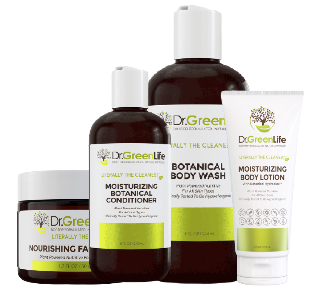
An iconic Shopify Store designed and built for Dr Green Life Organics
“Our customers were given the opportunity to embark on an unforgettable journey, forming meaningful connections with beloved characters and creating a truly one-of-a kind shopping experience.”
Ashley
Founder & CEO, Tired Mama


Apps we used:
Apps Utilized
A Shark Tank Shopify Store designed and built for Bertello

“Their immense knowledge of Shopify Plus and exceptional communication skills, accompanied by a can-do attitude made Arctic Grey a fantastic partner.”

Andy Bert
Founder


Apps we used:
Apps Utilized
A nostalgic UX shopping
experience designed for
Sesame Street

“Our customers were given the opportunity to embark on an unforgettable journey, forming meaningful connections with beloved characters and creating a truly one-of-a kind shopping experience.”
Michael C.
Principal, The Wildflower Group


Apps we used:
Apps Utilized
A sophisticated Shopify
Store designed and built
for State & Liberty
“The turn around times are typically always within 24 hours, sometimes even faster, and the work done is always phenomenal. We recommend Arctic Grey.”
Jake Allain
Chief Operating Officer


Apps we used:
Apps Utilized
An iconic Shopify Store designed
and built for Peanuts aka
Snoopy and the gang

“They created engaging opportunities for our customers to interact with the characters we love, turning shopping into an unforgettable experience.”
Michael C.
Principal, The Wildflower Group


Apps we used:
Apps Utilized

A delightful Shopify Store
designed and built for
Moonbug & Cocomelon

Through innovative initiatives, our customers were afforded the chance to form connections with beloved characters - transforming shopping into an entirely unique experience.
Michael C.
Principal, The Wildflower Group


Apps we used:
Apps Utilized
A luxury Shopify Store
designed and built for
SarahChloe
“Arctic Grey quickly distinguished themselves as a top-tier partner, armed with extensive Shopify Plus expertise and clear lines of communication.”
Zahava R.
Founder - Sarah Chloe Jewelry


Apps we used:
Apps Utilized
A charming Shopify Store
developed for Happy Little
Camper by Hillary Duff
“Throughout the process they demonstrated an unparalleled level of enthusiasm and commitment to success that truly made them stand out from the rest.”
Meagan H.
eCommerce Manager


Let’s get started. Which of these best describes you?
Complete Shopify Tasks Quickly
with
Bulk Hours
by Arctic Grey
We've built this AI chat box to help quote hours needed for projects, please provide as much details as possible in terms of what you'd like to build in this chat box, and we will give you an estimate of hours in real time.
